Context: About ProjectHub
ProjectHub is a project management application for science and research labs. In its terminology, a project is called a program. Project managers and scientists move from programs through objectives and deliverables to reach individual experiments, insights, and decisions.
This kind of workflow friction is a recurring theme in my portfolio work, especially when a product grows faster than its information architecture.
Navigation Problem
The existing flow asks users to move through several levels before reaching a specific experiment: program, objective, deliverable, and then experiment. That repeated drilling makes it harder to retrieve information quickly and interrupts the work users are trying to complete.
Existing Navigation Flow
Role and Goal
My role was to identify the navigation friction and propose a clearer search experience. The goal was to reduce the effort required to reach a known item without removing the hierarchy users still need for context.
It is closely related to the broader file-discovery problem I explored in this cloud storage UX case study, where users also lose momentum when systems make structure hard to understand.
Design Hypothesis
If search results identify what each item is and where it lives, users should be able to choose the right result with less backtracking. The proposal therefore combines two pieces of context:
- Type tags distinguish programs, objectives, deliverables, experiments, insights, and decisions.
- Breadcrumbs show each result’s location in the broader program structure.
Search and Breadcrumb Solution
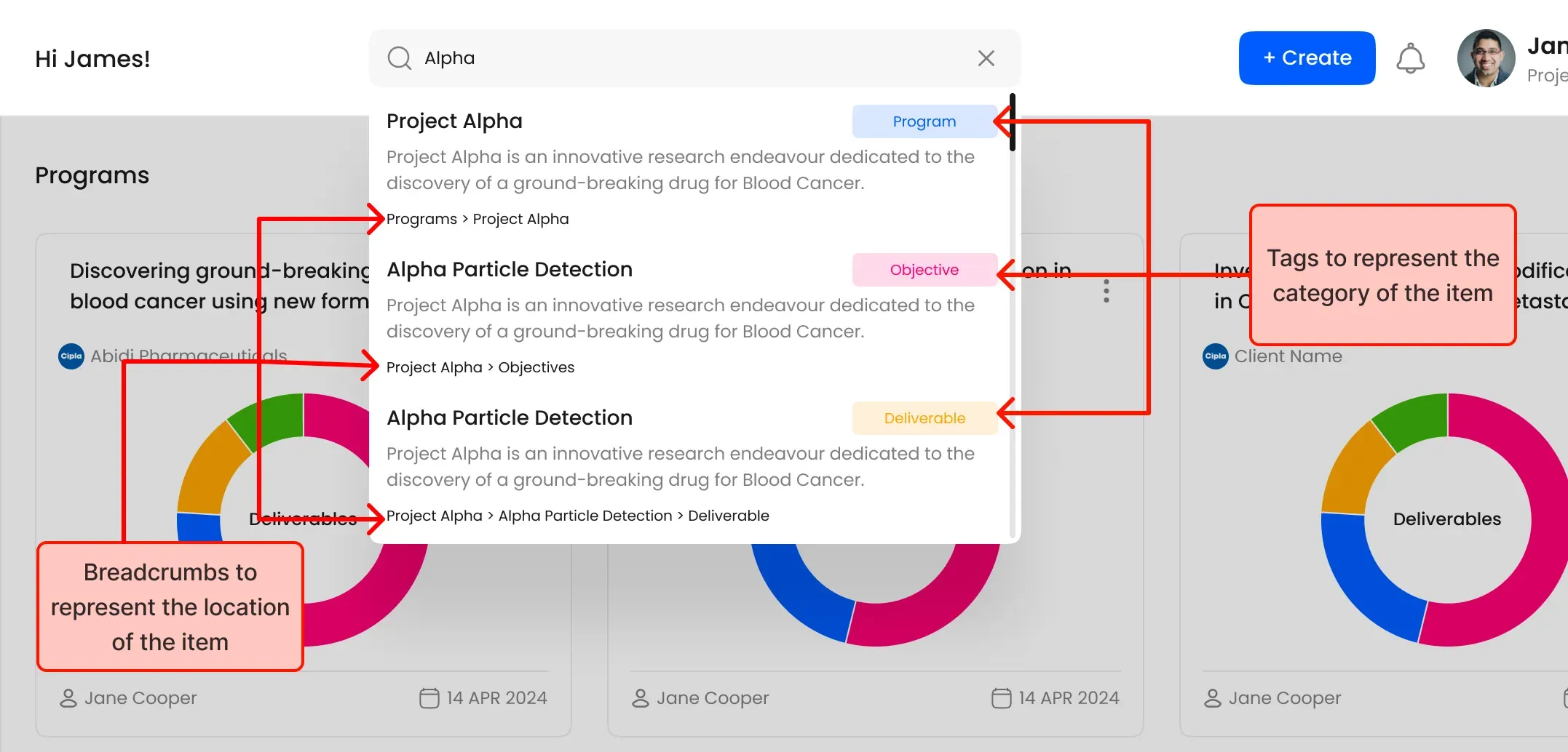
The result keeps search fast without flattening the application’s information architecture. A user can jump directly to an item while still seeing enough context to understand where it belongs.
Tradeoffs
- Faster recognition: Type tags and breadcrumbs help users distinguish similar results.
- Less repeated navigation: Search creates a direct path to deeply nested items.
- Keyword dependency: Users still need to remember part of an item’s name or related language.
- Visual density: Tags and breadcrumbs add information that must be balanced carefully to avoid overwhelming each result.
Validation Targets
The percentages below are targets for validation, not measured production results. A usability study should compare the existing navigation with the proposed search experience and measure:
- 30% less time spent locating a known item.
- 25% higher satisfaction with the navigation experience.
- Whether the added result context creates an initial-confusion increase near the anticipated 15% threshold.
Next Steps
The next step is a task-based usability comparison using representative programs and experiments. Results should determine whether labels need simplification, whether breadcrumbs should collapse on smaller screens, and whether search meaningfully reduces retrieval time before the proposal moves toward implementation.